







Cardconomy
92
Screens designed and built
3
User types
54
Design decisions logged
15
Cited research sources
Designed a three-sided UK trading card marketplace — then built it, and found out how far design and production drift apart when you own both. 92 screens, three purpose-built dashboards, and one vendor conversation that broke the original strategy.
The problem
- UK collectors buy and sell on platforms that were not built for them. eBay UK takes roughly 12–15% all-in once you add the final value fee, per-order fee, regulatory operating fee and VAT. Cardmarket is cheaper at 5% for private sellers — but it is a German platform, and since Brexit that matters.
- Cross-border purchases now carry customs handling, import VAT and delivery delays that did not exist in 2019. The cheapest listing in Europe is frequently not the cheapest card to actually receive.
- Local game shops are being squeezed out. Price visibility from the big platforms compressed the margin on singles — the product that, industry-wide, keeps shops solvent.
- And bulk is nobody's priority: listing 400 commons individually is not worth anyone's evening, so most collections sit in boxes. The gap was not another marketplace. It was one where the UK is the default rather than a shipping option.
How I approached it
- 1
Verified the market before designing anything
239 lines of desk research, 15 cited sources, one rule: every number carries a link or it does not get used. Market sizing, a fee-by-fee teardown of eBay UK, Cardmarket, Whatnot and TCGplayer, and four evidenced market problems. Where public data did not exist — there is no clean UK-only TCG revenue figure — I wrote that constraint down rather than estimating, so no later deck could quietly inflate it.
- 2
Modelled three users, not one
A collector wants the right card at a fair price without customs roulette. A seller wants inventory to move without an evening of data entry. A local game shop wants footfall and a buylist that does not eat staff time. These are genuinely different jobs, so each got a purpose-built dashboard rather than one dashboard with role flags.
- 3
Talked to a shop — and let it break the strategy
The original bet was local game shops as a supply channel. One shop owner told me it was the wrong problem: "a lot of these brands main issues aren't selling, its sourcing." I did not accept it and did not dismiss it — I checked all three of his claims against sourced industry data. Two were partly true, one was inverted, and together they killed the pitch.
- 4
Designed the system before the screens
30 shared components, one token set, and a geometry contract enforced in code rather than described in a document. The goal was that screen 61 would cost less to design than screen 6.
- 5
Built it in production tooling
Next.js and TypeScript, mobile and desktop from one route registry. Building it is what surfaced the most useful lesson in the project, and it was not a design one.
What the research changed
One conversation with a shop owner did more damage to my assumptions than the previous three weeks of desk research.
The original bet was local game shops as a supply channel: get shops listing their singles and the marketplace has inventory on day one. It is a clean story, so I took it to a shop owner — and he told me it was the wrong problem.
Three claims, each one undercutting the pitch. I did not accept them and I did not dismiss them; I checked all three against sourced industry data.
“a lot of these brands main issues aren't selling, its sourcing.”
“if they wanted to use the site for sealed products, our site doesn't solve the main issue that getting that product is still near impossible.”
“a lot of these other game stores use singles as loss leaders to get people in the door.”
What I changed
- The shop pitch moved from "we help you sell" to "we help you with trust, buylist intake and footfall." Selling was never their bottleneck — sourcing was, and for hot sealed product that is an upstream allocation problem no peer-to-peer platform can design around.
- Singles turned out to be the high-margin profit centre (roughly 45% versus 15–20% on sealed), not the loss leader the owner described. His instinct about the mechanism was right and the two products were swapped. That produced the uncomfortable finding: a UK singles marketplace risks amplifying the exact price transparency that squeezed those shops in the first place.
- The centre of gravity moved to collectors and peer-to-peer trading, with shops as trust, venue and community partners rather than as the supply channel.
- The "another brand did this and disappeared" claim checked out — it was PucaTrade, dead in 2021, killed by an uncapped synthetic currency plus a sender–taker imbalance. Its surviving competitor Cardsphere used real cashable currency. That validated a decision already made: no trade credit, no platform points, trades settle card-for-card or in cash.
- Trading strategy changed shape. The graveyard of in-person trading apps all died of the same thing — no local density — so the plan became seed a few cities deep, not the whole UK shallow.
Before & after
One vendor conversation, pressure-tested against cited sources, did more damage to my assumptions than the previous three weeks of desk research. He volunteered that he is not a typical game shop, so this is n=1 with that caveat attached — the value was not statistical.
Before
- Local game shops as the supply channel
- Shops list their singles; the marketplace has inventory on day one
- Pitch to shops: we help you sell
- National launch, UK-wide and shallow
After
- Collectors and peer-to-peer trading at the centre
- Shops as trust, venue and community partners
- Pitch to shops: trust, buylist intake and footfall
- Seed a few cities deep — local density is what killed the competitors
What I designed
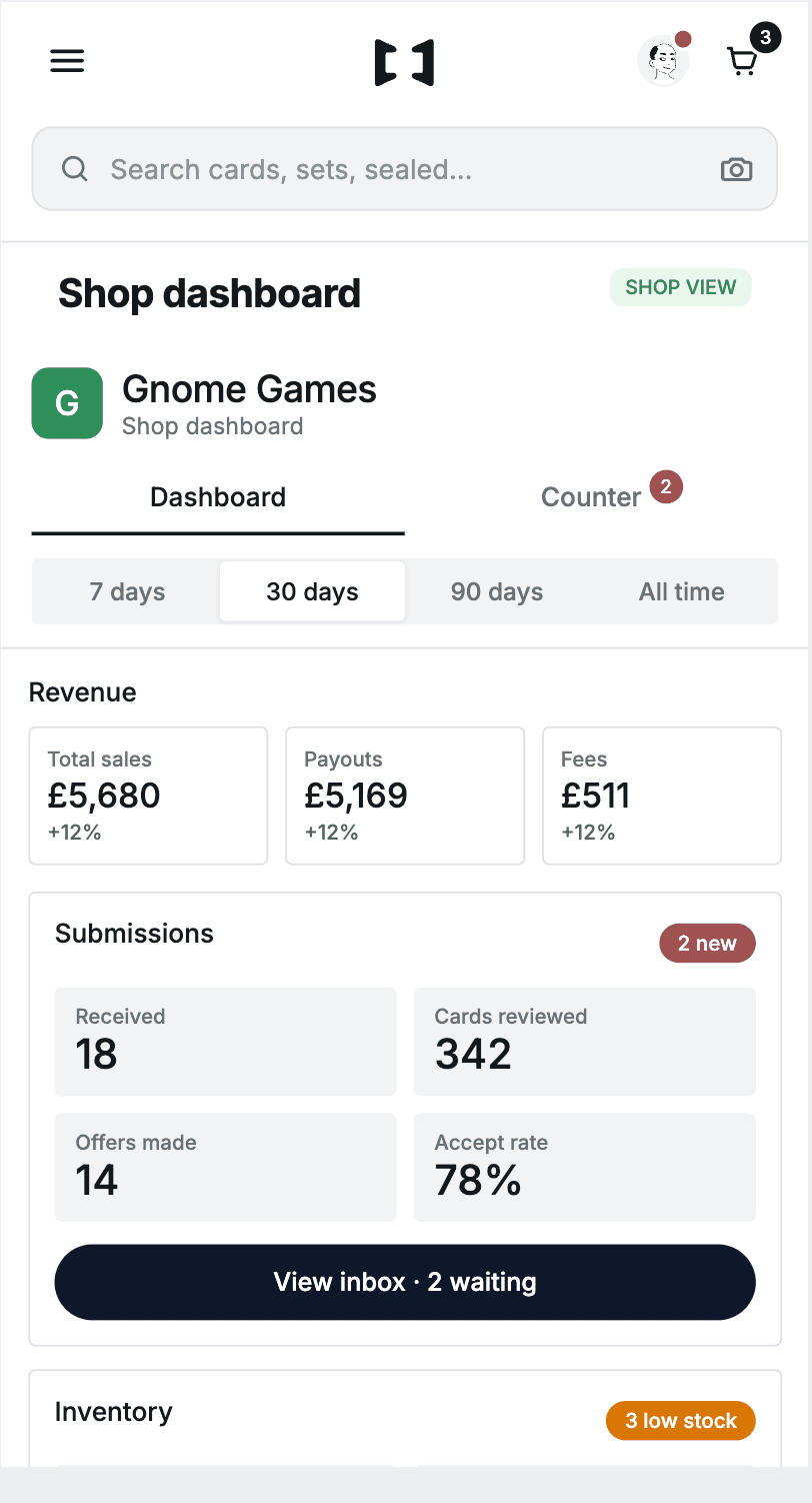
Three users, three purpose-built dashboards — nothing here is a permissions toggle on a shared screen.
Three users, three dashboards. The buyer's home is discovery — sets, trending cards, price movement. The seller's is throughput — what is listed, what sold, what needs posting today. The shop's is the counter — buylist submissions, in-store trades, footfall. Same design language, three genuinely different jobs, and nothing is a permissions toggle on a shared screen.
Selling that does not cost an evening. Three routes in, because "list a card" means different things: one card with photos and condition, a bulk lot priced as a single pile, and a scan-a-stack flow for volume. Bulk being nobody's priority elsewhere was a research finding, so it got a first-class path rather than a checkbox.
Buy orders, and the shop inside the product
Buy orders instead of endless watching. Name your price and condition and the platform matches you against future listings with a time-boxed exclusive window — turning "check every day" into "tell us once."
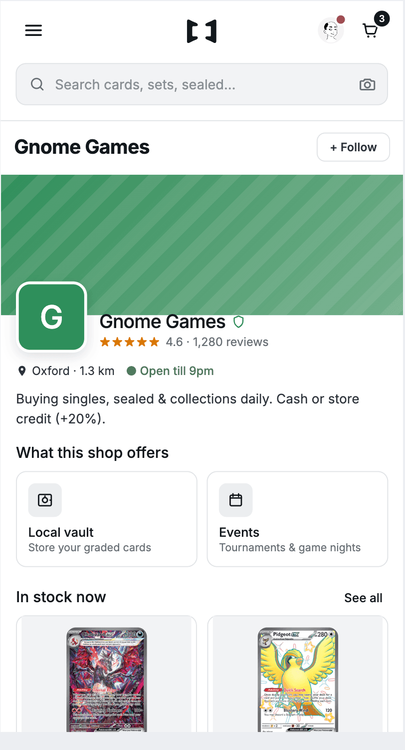
And the local shop sits inside the product: buylist submissions, in-store trade handoffs, and a storefront, so a shop is a place in the network rather than another seller row.
Paying once across three sellers
One payment, three sellers, three parcels — and a problem with one parcel affects that item alone.
A basket assembled from a multi-seller product page arrives at checkout as one payment and several parcels. The summary says so plainly — three cards, three sellers, three deliveries — rather than splitting the order into separate transactions the buyer has to reconcile.
Money is held in escrow per seller, so a problem with one parcel affects that item alone. It is the checkout answer to the trust question the whole three-sided model depends on.
The design system
One gutter per screen, enforced in code rather than written in a document — because a rule in a document survives about a fortnight.
30 shared components, a single token set, and one rule that mattered more than the rest: one gutter per screen, enforced in code rather than in a document.
Every screen picks one of two geometries. List and form screens put their inset on the scroller, so content contributes nothing. Card screens put no padding on the scroller and let each card carry its own margin. The shell component owns that choice and publishes it as a CSS variable that the breadcrumb and page title inherit.
The reason it lives in code is that the alternative does not hold. Written in a document, "screens are inset 16px" survives about a fortnight. Owned by the component, a screen physically cannot get it half-right — and when someone reaches for the wrong one, rows run to the screen edge while cards stay inset, which is visible immediately.
The same principle runs through the rest. One breadcrumb component that renders nothing when there is no ancestor to name, because a lone chevron is an orphan rather than a control. One notification blue, named once, so an unread dot and a new-listing badge cannot drift apart. One filled-button colour, so "primary action" means one thing.
Design to production: the part I did not plan for
I designed in a fast throwaway prototype — in-browser, no build step, instant feedback — and built the real thing in Next.js and TypeScript. Two repositories. That is a normal setup. What I had not reckoned with is how fast they come apart.
By the time I looked properly, the prototype was 219 commits ahead, touching 54 of its 82 files. The production app was faithfully implementing a design that no longer existed. Not because anyone was careless, but because the prototype is where thinking happens, and thinking does not wait for a port.
My first two attempts to fix a spacing complaint were guesses from a verbal description, and both missed. The third attempt loaded the prototype's screen and the built screen side by side and measured the computed values. It found the problem in one pass. That is the transferable lesson and it is about process rather than pixels: when two implementations disagree, put them next to each other and measure — do not reason from a description of the difference.
Reconciling them turned up things neither a design review nor a code review would have caught alone. A filter was hiding a seller's own stock — the facet row counted 13 listings while the grid showed 7, because a condition intended for one screen had been applied globally. Every seller photo was letterboxed on both breakpoints. Five hydration mismatches, where the server rendered one thing and the browser another, because a component read from local storage during render. A whole page had no back navigation. Seven "browse" buttons opened a search keyboard instead of the product grid.
What I would do differently
Talk to the shop first, not third. One conversation invalidated a strategic bet that weeks of desk research had left intact. Desk research tells you the shape of a market; it does not tell you that you are solving the wrong problem for the people you planned to build on.
Treat the prototype-to-production gap as a scheduled job. Drift is not a failure of discipline, it is a property of having two artefacts. Reconciling weekly would have caught the filter bug in an hour instead of after it shipped.
Decide the geometry contract on day one. Every screen designed before it existed needed revisiting; the ones after it cost a fraction as much.
Write down why, at the time. I kept a running log of design decisions with their reasoning, including the ones still open. Months later that is the difference between "why is this blue?" and a two-line answer. It also meant that when a fee figure appeared in the UI that had not actually been agreed, it got flagged rather than quietly becoming fact.
What's next: private sales
The deal is already happening in WhatsApp. Neither side has any protection, and that is the same problem everything else here solves.
Collectors agree swaps and sales in DMs and group chats every day. One person posts first and hopes; the other pays first and hopes. There is no escrow, no tracked handover, no record if it goes wrong — and no reason it has to be that way when the rails already exist.
This one is designed but not built. The working document below sets out the state machine and the clocks that make it trustworthy, separates what genuinely has to be built from what the marketplace already does, and lists the decisions still worth arguing about — starting with who is selling before the sale is made.
Try it
What it did
- The interface is complete across 92 screens on both breakpoints and runs as a production Next.js application. The domain model and API layer exist and are wired for a subset of flows; connecting the rest of the interface to real data is a known, scoped piece of work rather than an open question.
- Pricing and fees are deliberately not settled. The research established what competitors charge. What Cardconomy charges is a decision I have kept open rather than guessed at.